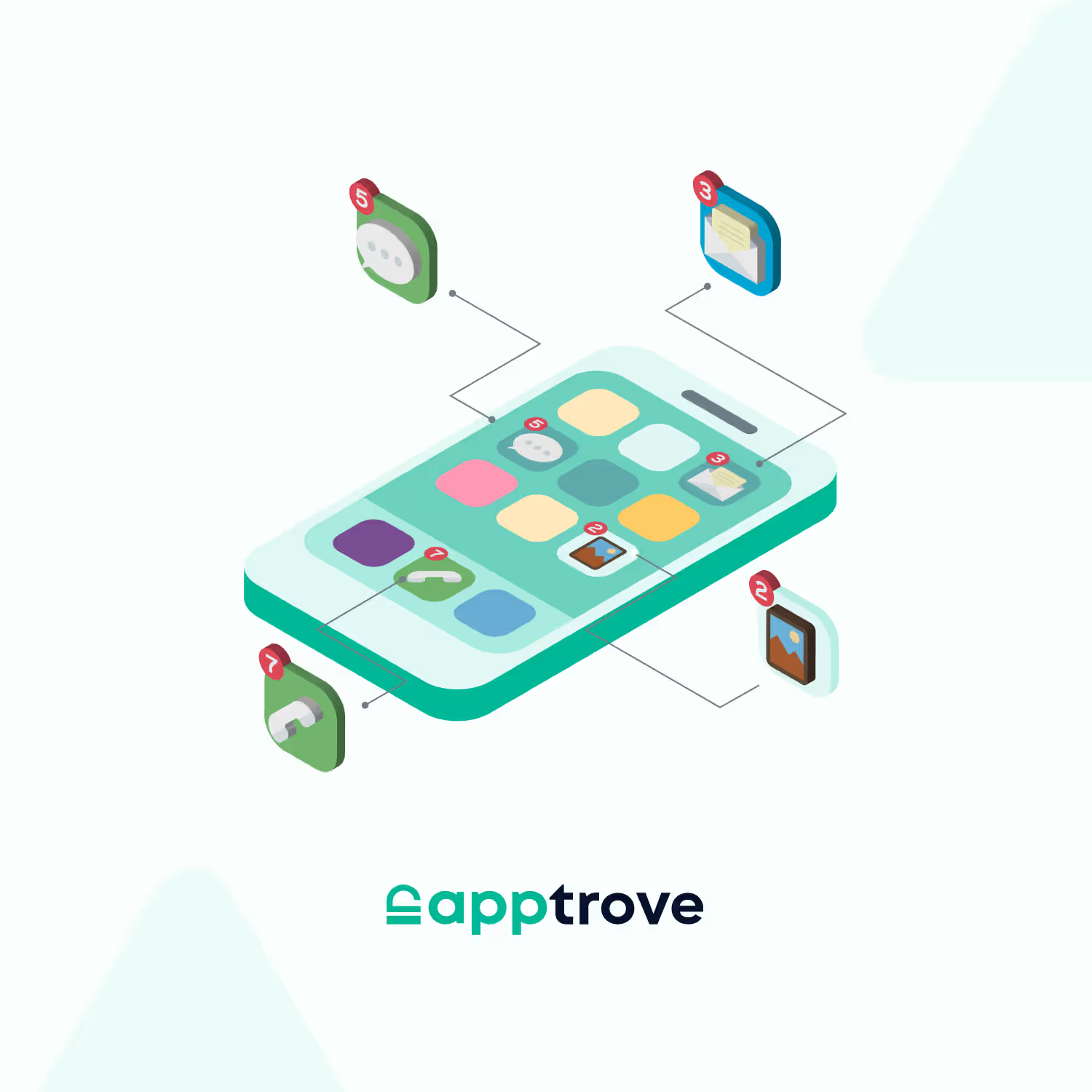
Mobile app icons are often put into a category and aren’t seen as a strategic element. App icons often come high up the list.
Usually, they’ll be designed early on in the process and won’t be touched until there’s a full rebrand or seasonal push. For the majority, they’re purely aesthetic.
However, they are one of the first things users will look at and they indicate trust, relevance, and intent. We live in a fast-moving world and users can often make snap decisions.
Evidence shows this works. Apple has released a case study around App Store optimisation where the brain-themed app icon for Peak Brain Training had 8% increased conversions compared to their original. This was based on a 98% confidence level. This shows we can test our app icons to find out which will be the most effective creative.
Despite the app icons having a huge impact, they are rarely tested, measured, and optimised in the same way as other elements such as campaigns and funnels.
This is a huge opportunity for app-first businesses. Application icons can be measured across every acquisition channel. Unlike many other growth factors.
What App Icons Actually Do Beyond Looking Good
While it may seem like app icons are a branding element, they actually have quite a functional purpose.
They are often the first interaction a user will have with your product. They’re often seen before any information, screenshots, or even the name of the app. As a result, app icons will determine if the user thinks your app is relevant, trustworthy, and of high quality. Therefore making them a conversion surface.
They’ll determine how well your app ranks in searches, how well it stands out in comparison to other apps in a crowded market, and how they’re perceived across your acquisition channels. They’ll also determine expectations.
However, they’re not often looked at with the same level of detail.
Where App Icons Sit in the Growth Funnel
To understand how important app icons are we can look at how they fit into your acquisition funnel.
Before a user clicks, they’ll be presented with a list of options. This will all happen in a matter of seconds, meaning users will heavily rely on visuals and will form an opinion on your app icon. They may not even think about the app name.
This means the user is making a decision before clicking.
They’ll be deciding whether they’re going to stop or not. Whether they think the app is relevant to them and whether they’re going to search for something else. This decision will determine every step in your acquisition funnel. So any mistakes made here will impact how well your funnel performs.
From a growth perspective app icons are a key element of your funnel but aren’t optimised.
The Hidden Link Between App Icons and Acquisition Efficiency
One of the best ways to understand how impactful app icons are is to understand how they influence acquisition efficiency.
If they’re helping users install or click on your app, even just slightly, they’ll improve the performance of all your acquisition channels. Paid advertising campaigns will become more effective, users will find your app via organic searches and you’ll see changes in your cost per install, regardless of increasing spend.
This is a key factor as businesses are starting to face scalability issues.
Growth teams are asking themselves how to improve the value of traffic they’re receiving rather than increasing traffic. App icons are a solution to this problem. They can create positive results without costing anything.
6 Tips for Choosing the Right App Icons For Your App
Choosing the right app icons for your app isn’t often seen as a strategic factor; however, they’re a key part of your acquisition. They’re always the first thing users will see when discovering your app. This means they’ll heavily influence how users perceive relevance, trust, and intent. This means even small improvements can create massive results.
1. Start With Recognition, Not Creativity
While you may want your app icons to be very unique, the key to driving users to your app is branding. Users don’t spend time thinking about what the image means. They’ll need to make fast subconscious decisions by looking at your app in the app store.
Therefore, the best app icons will be easy to read. Keep everything simple.
2. Make Category Signals Immediately Clear
Users rely on visual clues to determine what an app does. App icons can give users this information. If they don’t clearly indicate what category your app belongs to, such as commerce, finance, delivery or gaming, users will be unsure whether to click.
The best app icons will have just enough to hint towards what category they belong to. They’ll be similar but different. This is important as it will allow end users to easily classify your app. This will reduce extra effort required to start using your app.
3. Design for Context, Not Isolation
A common mistake is to design app icons without considering the environment they’ll be in. In reality, app icons will often be seen alongside a range of other icons.
As a result, you’ll need to ensure your app icon will stand out against others. If they’re too similar to the clutter, they’ll lose the opportunity to catch your users’ eye. No matter how much they fit your branding.
Ultimately, choosing an app icon requires you to know what your brand is, but also what the competition looks like.
4. Align App Icons With Your Acquisition Creatives
Often there is a gap between the ads and the app store content. This is often down to app icons. Users could be clicking on an interesting ad only for the app icon to be irrelevant or not match.
Such inconsistency can be a friction.
If your app icon matches your promotional assets, colour scheme, tone, or visuals, users will have a smooth transition between your ad and app store. This will increase the chances of users using the install option.
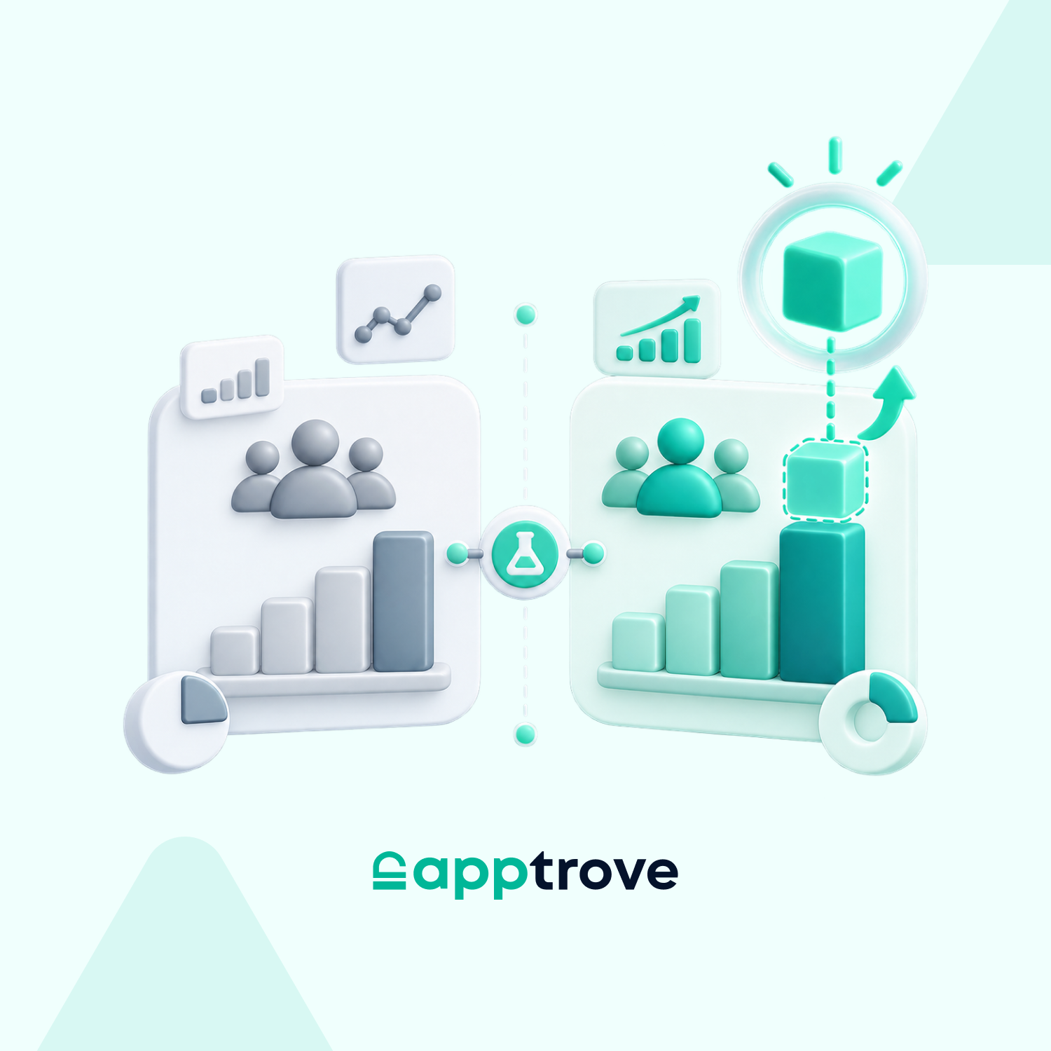
5. Treat App Icons as a Testable Growth Variable
Many teams will regularly test their ads, landing pages, and messaging. However, app icons are seen as unchangeable. This means you’re not able to improve performance at one of the first stages of your funnel.
However, there is potential to test application icons.
Small changes to your app icons, such as colour contrast and design, can have an impact on your tap-through rates. You should treat this in the same way as other experiments.
You can also test application icons alongside MMPs such as Apptrove. This means you can measure not only how many clicks you’re getting but also how good your users are.
6. Ensure the Icon Reflects the Actual Product Experience
It’s important that your app icons grab people’s attention, but it’s also important that they don’t create the wrong expectations. If there is a mismatch between your application icon and product, users could install your app but not engage. This will impact their retention.
Your main aim is to get the right users to install your app.
Good app icons will show what your product is at its simplest. This will remove any questions users have about your app and increase the chances of them staying.
Conclusion
App icons may not be seen as impactful based on traditional performance metrics.
They’re not easily seen in attribution; they don’t have their own dashboard, and we rarely think about them performing badly. However, they can have an impact on all areas of your acquisition.
As attribution becomes less reliable and costs increase, the small impacts will become more important. Growth is no longer driven by large obvious changes but instead by many small changes across the board.
App icons are one of these changes.
They sit on the edge of perception and performance. They’ll influence how users perceive your product. While they may not be the most complex part of your growth strategy, they’re the most noticeable.
If you’re willing to move away from seeing these as static elements, you can use them to your advantage. They’re easily accessible and can have a huge impact.
Sometimes it’s the app icon that decides whether something is considered or not.
FAQs
1. Do app icons really impact install rates?
Yes, studies around app store optimisation consistently show visual elements such as app icons have a large impact on click-through rates. Users make snap decisions, so app icons play a key role in deciding whether they’ll explore your app or not.
2. How do app icons affect user acquisition cost?
App icons will impact click-through rates. This will impact how effective your paid campaigns are. Increasing engagement at the top of your funnel can reduce your effective cost per install.
3. What size and format should app icons follow?
There are guidelines you need to stick to for each platform (Apple App Store and Google Play). These will include resolution, shape, and safe area. However, performance will be dependent on how clear and readable your icons are.
4. How often should app icons be tested and updated?
You should review your app icons when you see changes in your user acquisition performance, new competitors enter the market or there are advancements in your branding. Regularly A/B testing your icons can give you insight into which icons will have the highest conversion rates. This won’t be impacted by subjective opinions.
5. Why should app icons align with advertising creatives?
Having matching app icons and advertising visuals can make the user experience smoother. Having the same visuals throughout the customer journey will prevent confusion and users will become familiar with your brand.